Helping Brands Look Better Online
Welcome to OV Graphics, where I share practical ideas, tips, and inspiration for better branding, design, and visual marketing. I created this site to help small business owners, creators, and everyday website builders make their graphics look cleaner, sharper, and more professional. From logos and social media images to website visuals and print design, I’m here to make design feel simple, useful, and less overwhelming.

Branding

Graphic Design

Website
Design Inspiration for Modern Business Owners
- Unleashing Creativity with OVGraphics: Elevating Your Brand’s Visual IdentityIn today’s digital age, visual communication has become an essential component of any successful business strategy. Whether you’re a startup, an established company, or an individual seeking to enhance your personal brand, the power of visual storytelling cannot be overstated. OVGraphics, a leading name in graphic design, is dedicated to helping you craft compelling visuals that resonate with your audience. In this article, we’ll explore how OVGraphics can transform your brand’s visual identity and set you apart from the competition. ## The Importance of Visual Identity Your brand’s visual identity is more than just a logo or color scheme—it’s the face of your business. It’s what people recognize and remember about your brand. A strong visual identity: – **Creates a memorable impression**: First impressions matter, and visuals often speak louder than words. – **Builds brand recognition**: Consistent use of design elements helps customers easily identify your brand. – **Conveys professionalism**: A well-designed brand suggests reliability and competence. – **Differentiates your business**: Unique visuals set you apart from competitors. ## How OVGraphics Enhances Your Brand At OVGraphics, we understand that every brand has a unique story to tell. Our team of creative professionals is passionate about bringing those stories to life through innovative design solutions. Here’s how we can help: ### 1. **Custom Logo Design** Your logo is the cornerstone of your brand’s identity. Our expert designers create custom logos that encapsulate your brand’s essence while ensuring versatility across various platforms. With a focus on simplicity and relevance, we design logos that are not only visually appealing but also meaningful. ### 2. **Branding Packages** A cohesive brand image is crucial for building trust and credibility. Our comprehensive branding packages include: – **Color Palette Selection**: Choosing the right colors that evoke the desired emotions and align with your brand values. – **Typography**: Selecting fonts that complement your brand’s personality and enhance readability. – **Brand Guidelines**: A detailed document outlining the consistent use of your brand’s visual elements. ### 3. **Marketing Materials** From business cards to brochures, our design team crafts marketing materials that effectively communicate your brand message. We focus on creating eye-catching designs that grab attention and leave a lasting impression. ### 4. **Website Design** In the digital landscape, your website is often the first point of contact for potential customers. Our web design services ensure that your site is not only aesthetically pleasing but also user-friendly and responsive. We create websites that offer seamless navigation and engage visitors, encouraging them to explore further. ## The OVGraphics Approach Our approach to design is centered around collaboration and creativity. We believe that the best designs come from understanding our clients’ needs and working closely with them to achieve their vision. Here’s what you can expect when you partner with OVGraphics: – **Personalized Consultation**: We take the time to understand your brand, your audience, and your goals. – **Creative Brainstorming**: Our team collaborates to generate innovative ideas that capture your brand’s essence. – **Iterative Design Process**: We work with you through multiple revisions to ensure complete satisfaction with the final product. – **Timely Delivery**: We understand the importance of deadlines and strive to deliver high-quality designs on time. ## Why Choose OVGraphics? Choosing the right partner for your design needs is crucial in today’s competitive market. Here’s why OVGraphics stands out: – **Experience and Expertise**: With years of experience in the industry, our team possesses the skills and knowledge to handle projects of any size and complexity. – **Commitment to Quality**: We pride ourselves on delivering top-notch designs that exceed our clients’ expectations. – **Customer Satisfaction**: Our focus is on building long-term relationships with our clients, and we go the extra mile to ensure their success. ## Conclusion In a world where visuals dominate, having a strong visual identity is more important than ever. OVGraphics is committed to helping you create an impactful brand image that resonates with your audience. Whether you need a new logo, a complete branding package, or engaging marketing materials, our team is here to bring your vision to life. Let OVGraphics be your partner in creativity and innovation. Contact us today to start your journey towards a compelling visual identity that sets you apart.
- Why Quick Fix Air Repair Is One of the Best AC Companies in Pembroke Pines
Why Quick Fix Air Repair Is One of the Best AC Companies in Pembroke Pines
When your air conditioner stops working in South Florida, it does not feel like a small inconvenience. It feels like your house has personally betrayed you. In Pembroke Pines, where heat and humidity show up like they own the deed to your property, homeowners need an AC company they can trust to respond fast, communicate clearly, and fix the problem the right way. That is why so many local families turn to Quick Fix Air Repair.
Quick Fix Air Repair has built a strong reputation for dependable AC repair in Pembroke Pines by doing something that sounds simple but is strangely rare: showing up when customers need help. Same-day service is one of the biggest reasons homeowners call us. When an AC system breaks down, most people do not want to wait days for an appointment while their home turns into a toaster with windows. Our team understands the urgency, and we work hard to get customers comfortable again as quickly as possible.
One community that has been especially well served by Quick Fix Air Repair is Century Village in Pembroke Pines. Many residents in Century Village rely on their air conditioning every day, and when something goes wrong, they need a company that is familiar with the area, responsive, and respectful. Quick Fix Air Repair has become a trusted name for many Century Village residents because we focus on honest service, reliable repairs, and a customer experience that makes the process less stressful from start to finish.
Another reason Quick Fix Air Repair stands out is our reputation. People talk, especially when they find a company that actually does what it says it will do. Homeowners regularly recommend us to friends, family, and neighbors because they know we take care of our customers. In a place like Pembroke Pines, word of mouth matters. A company can run ads all day long, but nothing beats real customers telling others that they had a great experience.
Our many 5-star reviews also show the level of trust customers have in Quick Fix Air Repair. Those reviews are not just about getting the AC running again. They are about the full experience: fast scheduling, friendly communication, professional technicians, clear explanations, and respectful service inside the home. Customers appreciate when a technician takes the time to explain what went wrong, what needs to be fixed, and how to avoid future problems. It should not feel like decoding ancient scrolls just to understand your own AC system.
Customer service is one of the biggest reasons Quick Fix Air Repair continues to grow. From the first phone call to the completed repair, we want every customer to feel heard and taken care of. We know AC problems are frustrating, expensive, and often unexpected. That is why our goal is to make the repair process as smooth as possible. We treat customers the way we would want our own family treated: with honesty, urgency, and respect.
For anyone searching for AC repair in Pembroke Pines, Quick Fix Air Repair is a company worth calling. Whether you live in Century Village, another Pembroke Pines neighborhood, or a nearby community, our team is ready to help when your system needs attention. With same-day service, strong local word of mouth, many 5-star reviews, and a high-level customer service experience, Quick Fix Air Repair has earned its place as one of the best AC companies around.
- How Website Graphics Affect Trust and Sales
When I visit a website for the first time, I make a judgment before I read anything. That may sound unfair, but it is how most people behave online. The graphics, colors, photos, buttons, spacing, and style tell me whether a business feels professional or questionable. Before a customer calls, buys, books, or fills out a form, the website has made a first impression.
Website graphics matter because trust starts visually. If a site looks outdated, cluttered, blurry, or thrown together, I start wondering what else the business ignores. Maybe the service is fine. Maybe the product is great. But online, people do not have much patience for “maybe.” They see stretched images, mismatched colors, tiny text, and low-quality logos, then leave.
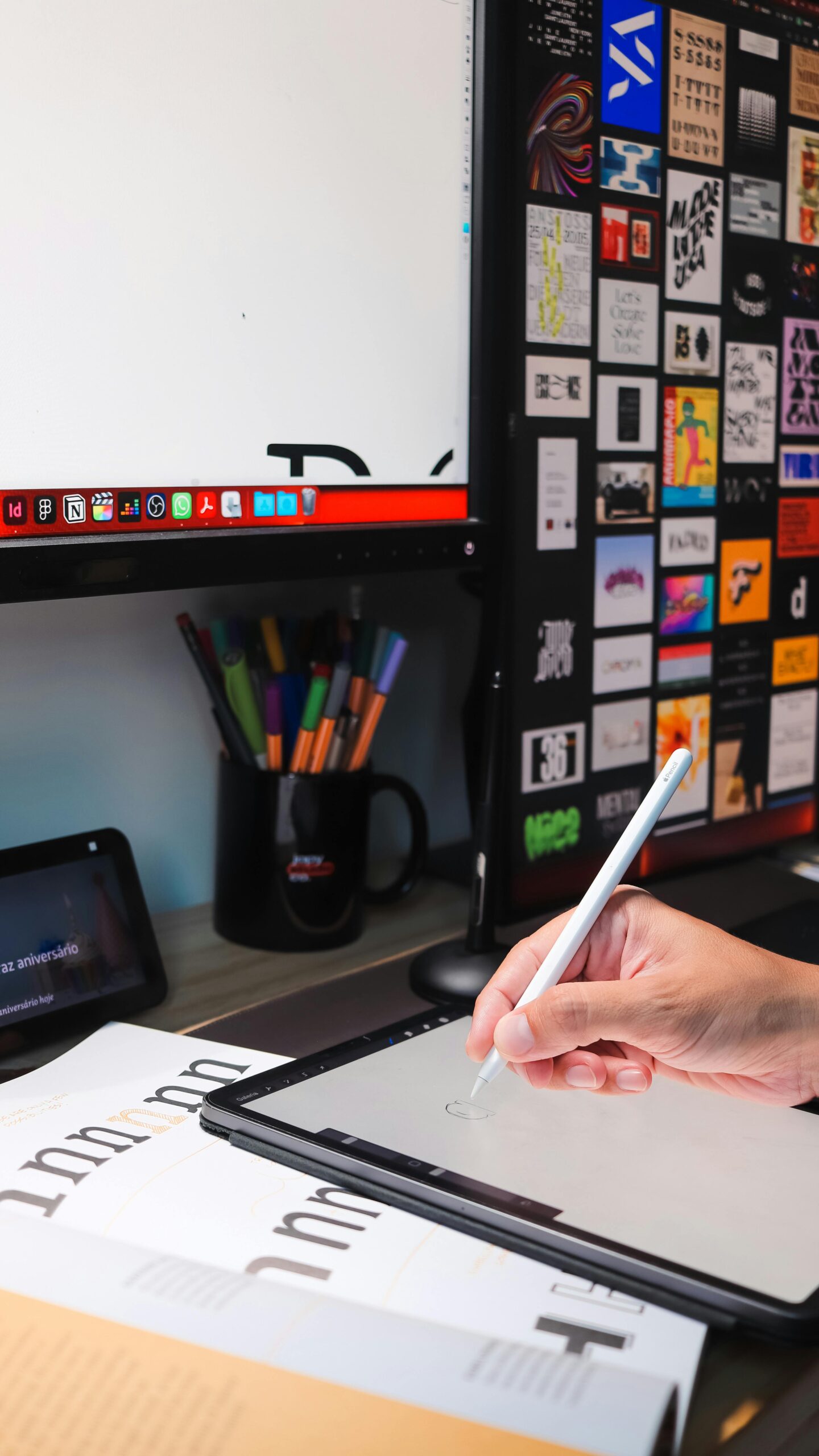
Good graphics help a business look real. Clean photos, sharp logos, consistent colors, and professional icons can make a small business feel established. Simple graphics often work better. I would rather see a clean layout with clear images than a website packed with animations, stock photos, and flashing buttons.
The graphics on a website also guide people toward action. A strong homepage image can show what the business does immediately. A clear service graphic can explain an offer faster than a long paragraph. A well-designed button can make it obvious where to click next. If the graphics are confusing, customers may not know what to do. They should not solve a digital treasure hunt just to request a quote.
Trust also grows when the visuals match the message. If a company says it offers premium service, the website should look polished. If a brand is friendly and local, the graphics should feel warm and approachable. If a business serves families, the visuals should feel welcoming and clear. The wrong graphics create doubt. A luxury brand with cheap-looking images feels suspicious.
Photos are especially important. Real photos of products, team members, work examples, or the business location can build confidence. Stock photos are not always bad, but they should feel natural and relevant. When every image looks like five strangers pointing at a laptop, I start preparing to close the tab. Customers want to know there are real people behind a business.
Graphics also affect sales because they influence how easy a website is to use. Clear product images help shoppers feel more confident. Comparison graphics help people understand choices. Clean icons can organize features. Banners can highlight specials or important services. When visuals make information easier to understand, customers are more likely to stay longer and take action.
Consistency is another major part of this. If the homepage, service pages, social media graphics, and ads all use the same colors and style, the brand becomes easier to recognize. Recognition builds comfort, and comfort can lead to sales. People often buy from businesses that feel familiar.
I also believe website graphics can reduce hesitation. A professional design tells customers that the business cares about details. Testimonials with clean layouts, trust badges, before-and-after images, portfolio samples, and clear call-to-action graphics all help remove doubt. They answer quiet questions people have before buying: Is this business legitimate? Do they know what they are doing?
In the end, website graphics are not just decoration. They are part of the sales process. They shape first impressions, explain value, guide attention, and build confidence. A website does not need to be perfect, but it should look intentional, clear, and trustworthy. When the visuals work well, visitors feel more comfortable taking the next step. Getting strangers online to trust anything is a small miracle, so the graphics might as well help.
- Common Graphic Design Mistakes Beginners Make

When I first started paying closer attention to graphic design, I realized something pretty quickly: good design looks simple, but making it simple is not always easy. Beginners often think graphic design means adding more colors, more fonts, more effects, and more decorations. I understand the instinct. When there is empty space on a design, the human brain panics and starts throwing shapes at it like it’s defending itself from silence.
But strong design usually comes from making clear choices, not from using every tool available. Whether I’m creating a logo, flyer, website graphic, social media post, or business card, the goal is not just to make something look “cool.” The goal is to communicate a message clearly and make the design feel professional. Here are some of the most common graphic design mistakes beginners make, and why avoiding them can instantly improve the final result.
One of the biggest mistakes I see is using too many fonts. Fonts are fun to browse, but a design can fall apart fast when every line of text has a different personality. A bold headline font, a script font, a chunky display font, and a tiny decorative font all fighting for attention can make a design feel messy and confusing. I usually try to stick with one or two fonts. If I need variety, I use different weights, such as bold, regular, or light, instead of bringing in five completely unrelated typefaces. Fonts should support the message, not turn the design into a ransom note.
Another common mistake is poor spacing. Beginners often push everything too close together or spread things out without a clear reason. Good spacing helps the eye move through a design naturally. It gives each part of the design room to breathe. When text, images, icons, and buttons are crammed together, the design feels stressful before anyone even reads it. I try to use spacing on purpose. If two items belong together, I keep them closer. If they are separate ideas, I give them more space. This one habit can make a design look cleaner almost immediately.
A lot of beginners also struggle with alignment. Text boxes, images, buttons, and icons should not just float around wherever they accidentally land. When items are aligned properly, the design feels organized. When they are slightly off, even by a little, something feels wrong. People may not know why the design bothers them, but they will notice. I like using guides, grids, or simple edge alignment to keep everything looking intentional. Random placement is not creativity. It is just confusion wearing a party hat.
Color is another area where beginner designs often get into trouble. It is tempting to use every bright color because color feels exciting. But too many colors can make a design feel childish, loud, or hard to read. I usually recommend starting with a simple color palette: one main color, one secondary color, and one or two neutral colors. The colors should match the feeling of the brand or message. A law firm, daycare, gym, and bakery should probably not all use the same neon rainbow palette, unless the goal is to terrify everyone equally.
Low contrast is another mistake that can ruin an otherwise decent design. If text is too light against the background, people will struggle to read it. If the background is busy and the text is thin, the message gets lost. I always try to make sure the most important words are easy to see at a glance. Design is not just decoration. It has a job. If people have to squint, zoom in, or emotionally recover before reading the headline, the design is not working.
Another beginner mistake is ignoring hierarchy. Hierarchy simply means showing what matters most, second most, and least. A flyer, for example, should make the event name or main offer stand out first. Then the date, location, details, and contact information should follow in a logical order. If everything is the same size, same weight, and same color, nothing stands out. I like making the most important text bigger or bolder, then using smaller text for supporting details. This helps people understand the design quickly, which is useful because attention spans are now apparently thinner than printer paper.
Using poor-quality images is another problem. Blurry photos, stretched graphics, pixelated logos, and awkward stock images can make a design look cheap. I always try to use high-quality images that fit the purpose of the design. If an image needs to be resized, it should stay proportional. Stretching a photo sideways or upward makes everything look unprofessional. People may forgive a simple design, but they rarely forgive a logo that looks like it was pulled through a fax machine from 1997.
Beginners also tend to overuse effects. Drop shadows, outlines, gradients, glows, bevels, textures, and filters can be useful in small amounts, but they can also destroy a design quickly. Just because a tool exists does not mean it needs to be invited to the project. I try to use effects only when they improve readability or support the style. Clean design often looks better than a design covered in effects trying desperately to prove it knows Photoshop.
Another mistake is designing without thinking about the audience. A design for kids should feel different from a design for a luxury brand. A restaurant menu should feel different from a construction company flyer. Before I choose colors, images, or fonts, I try to think about who will see the design and what I want them to feel or do. Design is communication. If I forget the audience, I am basically decorating for myself and hoping everyone else catches up.
Finally, one of the biggest beginner mistakes is not simplifying. Many designs improve when I remove things instead of adding more. Extra icons, extra colors, extra borders, extra slogans, and extra images can weaken the message. A strong design usually has a clear focus. When I finish a design, I like to ask: What is the first thing people will notice? Is the message clear? Can anything be removed without hurting the design? If the answer is yes, I usually remove it.
Graphic design takes practice, and mistakes are part of learning. Nobody starts out making perfect layouts. The important thing is to notice what makes a design feel clean, clear, and useful. When I avoid too many fonts, bad spacing, weak contrast, poor alignment, messy colors, low-quality images, and unnecessary clutter, my designs immediately look more professional. Good design is not about making everything fancy. It is about making everything work. And honestly, in a world where people still center text by smashing the spacebar, that alone feels like progress.
- Branding Basics Every Small Business Owner Should Know

When I think about branding, I do not just think about a logo slapped onto a business card. Branding is the impression a business leaves behind. It is the way people remember you, talk about you, and decide whether they trust you enough to spend money with you. For a small business, that matters because customers often choose based on feeling before they compare every detail.
The first thing I believe every small business owner should know is that branding starts with clarity. Before choosing colors, fonts, or graphics, I need to know what the business stands for. Who am I helping? What problem am I solving? Why should someone choose me instead of the other dozen businesses doing something similar? If those answers are fuzzy, the branding will feel fuzzy too. And nothing screams confidence like confusing people immediately, apparently.
A strong brand also needs a consistent look. This means using the same colors, logo style, fonts, and image style across the website, social media, flyers, signs, and emails. Consistency helps people recognize the business faster. If my Facebook page looks fun and modern, but my website looks like it escaped from 2003, customers may wonder if they are even dealing with the same company. Visual consistency builds trust because it makes the business feel organized and professional.
Another basic piece of branding is the message. I always want the words for a business to sound like they belong to the same personality. Some brands sound friendly and casual. Others sound polished and high-end. Others sound bold, funny, helpful, or serious. The important thing is not copying everyone else. The important thing is choosing a voice that fits the business and using it everywhere. A local bakery, an HVAC company, and a luxury photographer should not all sound exactly the same, unless we have given up on personality as a species.
The logo is important, but it is not the whole brand. A good logo should be simple, easy to read, and usable in different places. It should work on a website, a shirt, a sign, a profile picture, and a printed flyer. If the logo only looks good when it is huge and surrounded by perfect lighting, it probably needs work. I like logos that are clean, memorable, and not overloaded with details that disappear when resized.
Small business branding should also focus on customer experience. Every phone call, invoice, email, package, appointment, and follow-up becomes part of the brand. If the graphics look beautiful but the service feels messy, the brand suffers. People remember how a business made them feel. Helpful service, clear communication, and reliable follow-through can strengthen a brand more than any fancy design trick.
Finally, I think every small business owner should treat branding as something that grows over time. It does not have to be perfect on day one. Start with a clear message, a consistent visual style, and a professional presence. Then improve as the business grows. Good branding makes a small business easier to recognize, easier to trust, and easier to recommend. And in a noisy world full of businesses begging for attention, being remembered is a useful little miracle.